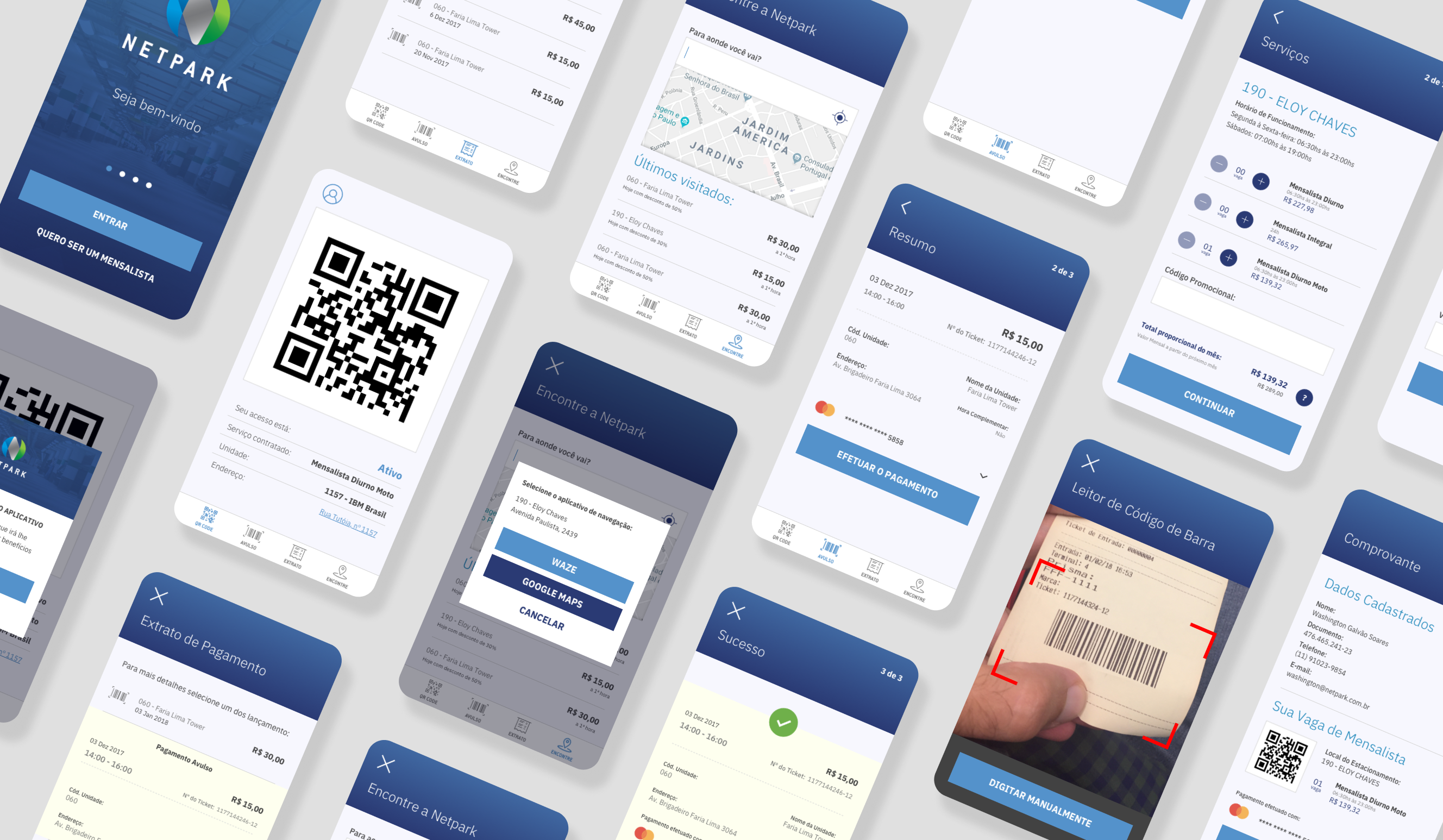
Netpark Mobile App
Improving the parking experience for Netpark's customers.
Information Architecture, User Experience and Interface.
Situation
Netpark operated high-traffic corporate parking facilities across seven places, but their system was stuck in the analog age. Customers relied on physical tickets and manual payment kiosks, creating:
- Long queues during peak hours (morning rush and evening exit)
- No customer relationship beyond daily transactional touchpoints

Tasks
Design a mobile App that would modernize Netpark's parking experience while introducing digital capabilities. Primary Goals:
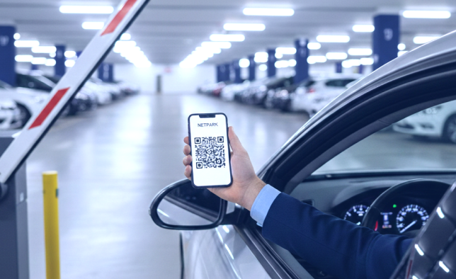
- QR code-based for entry and exit
- Implement monthly subscription payment options for regular users
- Create location discovery feature to find nearby Netpark facilities
Actions (1 to 5)
1. User Research & Strategy
Understood user pain points through contextual research at parking facilities during peak hours:
- Observed user behavior at kiosks and entry/exit points
- Identified friction in the current experience:
- ticket loss
- queue anxiety
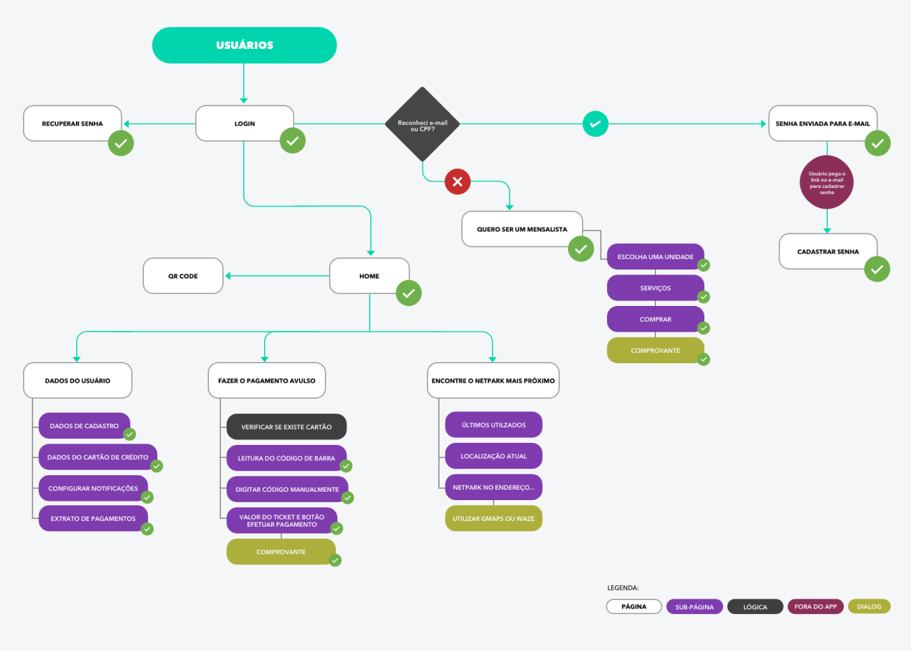
2. Information Architecture
Created a sitemap that organized the experience and helped the developers to start the foundation of the App.
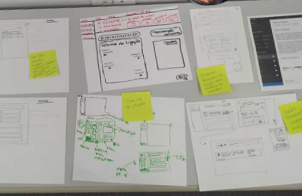
3. Low-Fidelity Validation
Started with wireframes to validate:
- Navigation patterns
- Information hierarchy
4. High-Fidelity Design
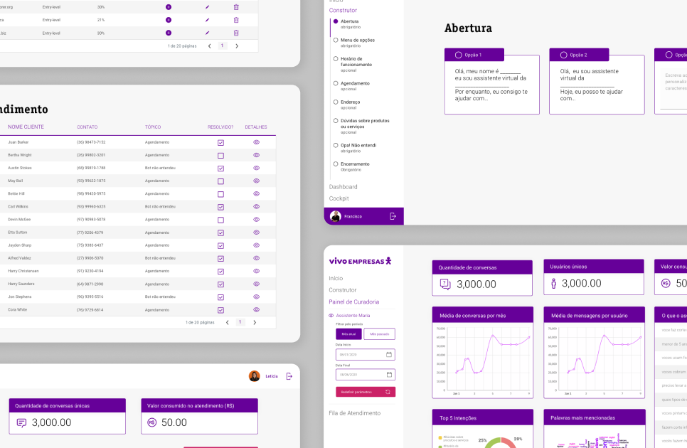
Created a clean visual system that communicated.
Design Principles:
- Speed: Minimal steps to core actions
- Accessibility: High contrast for outdoor visibility
- Minimalist: UI to reduce cognitive load
Results
Immediate Impact (first year - 2018)
- Significant reduction in physical queues during peak hours
- 30% increase in user loyalty through monthly subscriptions
Long-Term Success (7 years - 2026)
- 10,000+ downloads on Google Play Store
- 4.2 of 5 star rating with hundreds of reviews